Do you remember what your inbox looked like during the last Black Friday promotion week? Most likely it was full of look-alike newsletters with dark backgrounds and flashy fonts. It must be quite challenging to pick a newsletter that really stands out.
If you are willing to send truly outstanding emails in 2020, continue reading. We asked some of our designers to share the hottest newsletter design trends for this year.
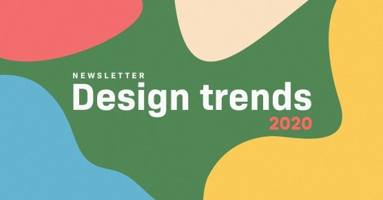
Here’s a quick breakdown of email design trends for 2020:
- Big & bold fonts
- Illustrations instead of photos
- Strong colors
- Minimalism
- Accessible design
- Broken layout grid
1. Big & bold fonts
Be prepared to receive more and more emails containing bigger and bold typography.

2. Illustrations instead of photos
Indeed, photos can give your newsletters a personal touch and make them more relatable. Yet, in most cases, illustrations have taken the place of photos in emails.
Illustrations convey the aesthetic of your brand better than any photography. Also, beautifully made illustrations make a more long-lasting impression.
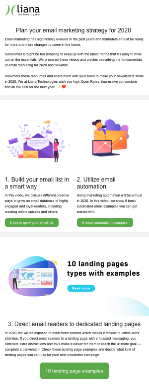
Here’s how we leveraged illustrations in our last newsletter:
If you don’t have an in-house designer, there are lots of stock illustrations available for free download. For example, try Undraw or Manypixels.
3. Strong colors
Pink, yellow, and other eye-catching colors will be more common in newsletter design in the future. With these colors, you will definitely drive more attention to your emails.
Remember to be extra careful with strong colors and make sure your color palette corresponds to your business ideology.
Check out this piece by Canva on how to choose a color that suits your brand.
4. Minimalism
Minimalist style is no longer a phenomenon only for interior design. Compact and laconic newsletter templates are gaining more traction as well.
5. Accessible design
Put the reader first. More and more people tend to experience different kinds of impairment, be it color blindness or cognitive disorders.
In 2020 and onwards, your newsletters should be accessible to all. This includes, but not limited to:
- Keeping a logical reading order
- Considering the font type and size for visually impaired users
- Choosing a color scheme accordingly

Read our article on how to design accessible websites.
6. Broken layout grid
Irregular or broken layout grid is used when elements are positioned in a non-linear way. The trend is common for modern websites (for example, check out Carbon Beauty or Times Talks) and is gaining more popularity for newsletter templates.

By going off-grid, you can design your newsletters to be longer and more informative. This will build more curiosity for your readers and make your emails more engaging.
Sending appealing newsletters is crucial. However, you should also take into account other aspects of email marketing, such as how to grow your email list, how to segment your database and many others. Grab your copy of our advanced email marketing guide to learn more.

Comment
Comments
No comments