How can you increase the click-through rates of your newsletters, boost the sales of your online store, or improve the conversion rate of your website? In other words, how do you accomplish the main goals of these channels?
A Call-to-Action (CTA) is used to make a reader perform a desired action that fulfills the main goal of the marketing content or channel in question. Some examples of CTAs are the Buy now buttons on online stores, or Learn more links on articles or newsletters.
In the digital marketing context, they are often referred to as Call-to-Action buttons, as they tend to be designed to stand out from the rest of the content. The button is usually clearly visible, and it often has an attention-grabbing teaser text.
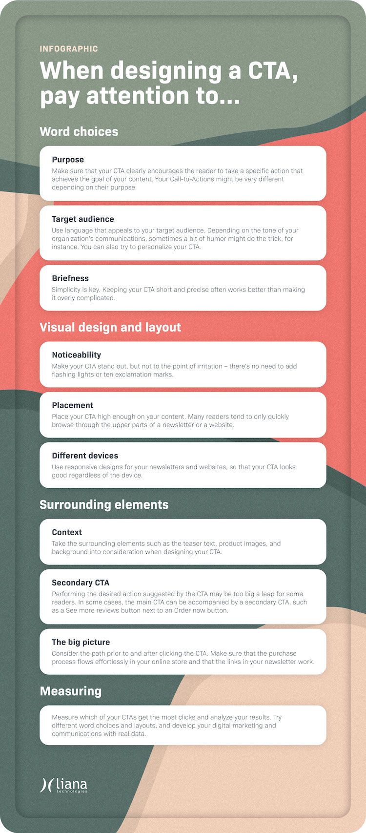
What are the main issues to consider when using and fine-tuning Call-to-Actions? Read these 7 tips and check out the infographic at the end of this blog post.
1. Design for a specific context
Where will you be placing your Call-to-Action? Whether it is a newsletter, an ad, a landing page or an online store, the CTAs might have different requirements for different channels. It is therefore important to design your CTA button to really stand out from the rest of the content.
For newsletters, the consistency between your CTA copy and the introduction text might impact your CTA’s efficiency a lot. For online stores, on the other hand, the most crucial factor might be the clear visual design of the button, as the products on a website are often surrounded by images, descriptions and other elements.
Always consider the specific context when designing your Call-to-Action.
2. Optimize for various devices
According to Statcounter, mobile users make up over half of all internet traffic today. Make sure that your Call-to-Action is optimized for different end devices, such as smartphones, tablets, or desktop computers.
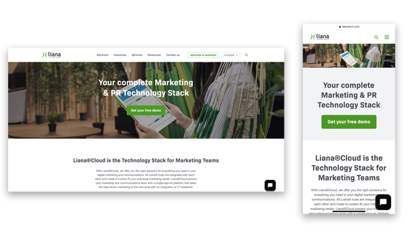
Use a responsive design for your newsletters and websites, so that your CTA looks good regardless of the device. Make sure that the button fits screens of different sizes, while preferably keeping the design the same.

Our website is optimized for both desktop and mobile users.
3. Different Call-to-Actions for different purposes
Think about the following: what is the primary goal you want to achieve with your CTA in this particular context? Is its aim to increase your blog’s traffic, nurture a lead on the buyer’s journey, or perhaps get feedback on a product or a service?
Your Call-to-Actions might be very different depending on their purpose. In many cases, you might want to steer away from the most generic ones, such as Learn more.
In this video, our Marketing Specialist Elena shows examples of how Trello uses unique Call-to-Actions in their newsletters, at 2:40.
Note! To see the video below, give cookie consent to the Marketing section. Open cookie manager.
4. Understand your audience
Who are the people you want to get a reaction from? What would make them perform the desired action?
Offer incentives such as quality content for the reader and get creative. Depending on your target audience and tone of voice, sometimes a bit of humor might do the trick, for instance.
Utilizing personalization in your CTAs can make them more effective. Today's technology offers many kinds of opportunities for marketing automation and triggered communication. With the help of technology, you can have different Call-to-Actions depending on which channel the person came from, and what their action was prior to seeing your CTA.
5. Brief and noticeable CTAs
Keeping your Call-to-Action short and precise often works better than making it overly complicated. This also tends to make the visual design more clear, and allows you to fit the button on a single row.
Make your CTA stand out, but not to the point of irritation – there’s no need to add flashing lights or ten exclamation marks. However, we do recommend you pay close attention to the colors and design as well as the surroundings of your button.
Does it pop out enough or are there too many distractions elsewhere on the site? Do the surrounding elements such as products description and images support the CTA?
In addition, give careful consideration to the placement of the CTA. Many readers tend to only quickly browse through the upper parts of a newsletter or a website. Because of this, your CTA should be placed high enough on the email or webpage.
You can run a heatmap analysis of your website or landing page to find the best placement for your CTA. This can be done, for example, with Hotjar or VWO.
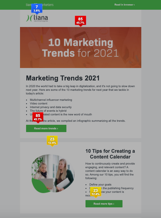
We use the heatmap feature of our email marketing tool LianaMailer for our newsletters to find out which links get clicked the most. The tool allows you to assess whether your CTA is clear enough, or if it seems to get lost between the other elements of the newsletter.

LianaMailer’s heatmap feature shows us which elements of our newsletter have been clicked the most.
6. Consider a secondary CTA
Performing the desired action suggested by the CTA may be too big a leap for some readers. Sometimes the main Call-to-Action can be accompanied by a secondary CTA, such as a See more reviews button next to an Order now button. The secondary CTA button is often designed in a way that separates it from the main CTA by using different graphics or colors.
You should also reintroduce the main Call-to-Action later on to those readers who chose to click on the secondary option. This way you may convince your leads to perform the desired action such as making a purchase after all, instead of bouncing off your website.
7. Analyze and double-check the path
When you’re assessing the effectiveness of your Call-to-Action, it’s important to consider the path that leads to it. What were the reader’s actions prior to seeing the CTA? Is the path tempting enough to make your target audience actually perform the desired action?
What happens after the CTA button is clicked: does its color change or will the reader be directed to a new landing page, for example?
You must look at the big picture and consider your digital marketing and its channels holistically. For instance, if you utilize a CTA in your newsletter, such as a link to an article, is your website up-to-date and functional? Does the purchase process flow effortlessly in your online store?
The Behavior Flow feature on Google Analytics is a great tool for assessing your website users’ path. Even a well-made Call-to-Action won't be useful if technical issues or any other kinds of inconsistencies emerge along the way.
Measure and analyze your results
Get the most out of your digital marketing by measuring and analyzing the performance of your CTAs. Try different word choices, visual elements, and placements and make adjustments based on real data. This allows you to improve your communications and digital marketing.

In order to create attention-grabbing CTAs, you need modern marketing and communication tools. Liana Technologies offers a wide range of user-friendly digital marketing solutions that will help you to get the most out of your marketing efforts.
![7 Tips for Using Call-to-Actions [infographic]](https://www.lianatech.com/media/blog/7-tips-for-using-call-to-actions/cache/cta-header-en-556x313.png)


![7 Tips for Using Call-to-Actions [infographic]](/media/blog/7-tips-for-using-call-to-actions/cache/cta-header-en-378x214,c.png)