
So, you are in charge of sending a newsletter on behalf of your organization. It looks great for you, all pretty in your brand colors, all elements in place, and proportionate with the right fonts. You are sure it will look just as good for every receiver because it looks great for you, right?
Wrong! There are a few things that need to be considered in order for your newsletter to look similar (and good) for every receiver.
Know Your Limitations
Like many great things, also awesome newsletters start with great design. The designer needs to be aware of the limitations newsletter as a medium sets for the design. These limitations come from understanding the limitations of different email clients. You might be familiar with Gmail and Outlook but there are many other email clients out there and it’s inclusive to cater to as many as you can.
Talking about Outlook, it is one of the most limited ones. The limitations come down to the rendering engine that some Outlook versions use for HTML code. This engine uses Microsoft Word which is not and was never meant to be a full HTML editor. Most of the newer versions perform better but you never know what version the recipient is using.
Still, Outlook is also one of the most common email clients that many organizations utilize due to it being part of the Microsoft ecosystem. So you kind of need to at least acknowledge what Outlook does to your pretty newsletters. It might be the case, for example, that rounded edges of elements become rectangular.
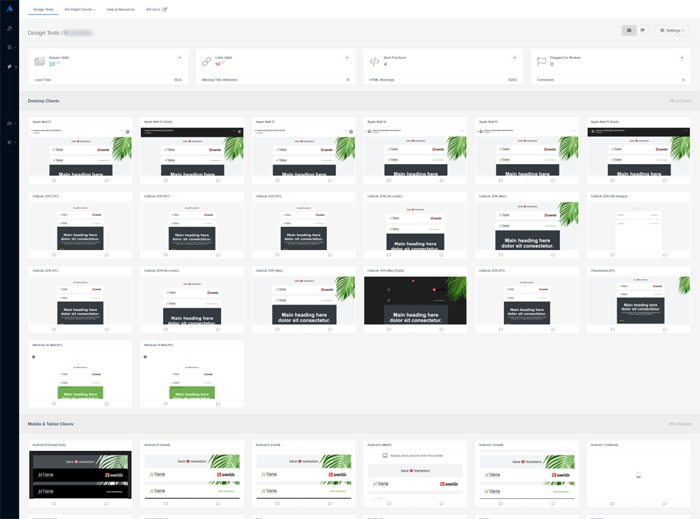
 Litmus testing shows that older Outlook versions turn rounded edges into rectangular ones.
Pay Attention to Fonts
Fonts are one of the main things to consider when determining what you want the newsletter to look like for your receivers.
Using web fonts is advisable even if the email client wouldn’t show the one you have chosen for your newsletter. There is always going to be a foolproof one that the client will show, such as good ol’ Arial. Gmail and Outlook won’t display web fonts as such but your failsafe choice will be displayed.
The not-so delightful thing about fonts is that numerically, your fonts might be one thing but then physically on the letter they are something else. So pay attention to the physical appearance and don’t always trust the numbers.
Apple programs use the WebKit rendering engine which will show all the newest fancy stuff on your newsletters. Gmail also uses WebKit but limits the functions in any case. So, the situation will always remain that some clients just cannot handle certain parts of your design but obviously you’d still want to cater to the ones that can…The solution is:
Progressive enhancement
Progressive enhancement is two fancy words put together but it basically means that if the recipient’s email client is equipped to show your newsletter’s fanciest stuff it will and if it’s not then a basic version will be displayed. Both versions exist simultaneously.
Progressive enhancement needs to be coded into your newsletter template. It is also mobile-use friendly which is something you should always keep in mind when designing and implementing newsletter templates. More than half of your recipients will open your newsletter on mobile so you need to be thinking about this.
Size Matters
The length of your newsletter becomes an issue for some email clients. Mainly the really popular Gmail. Gmail does this marvelous thing of just mercilessly cropping your newsletter once the number of bytes that Gmail allows is full.
Custom-made Design
With a professional newsletter software provider, you can be sure that your newsletter template has been built in a way that gives the best starting point for your message to look the same for every receiver.
When the template is made-to-order for your organization, there is no way to mess up the design of your newsletter. Your brand colors and the right fonts are in place in all the elements and the elements themselves are built according to your wishes. This means that you always have the same building blocks to your newsletter that keep the look and feel always the same.
Test It Out
A foolproof way to check what your newsletter looks like on different devices, different clients, and different browsers?
Testing.
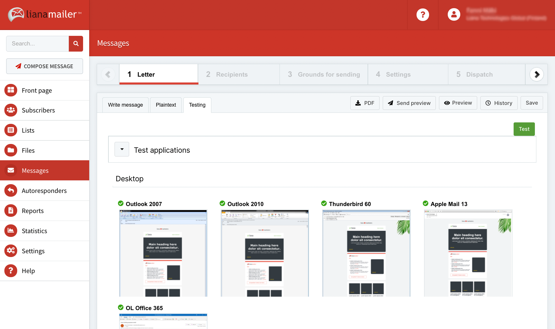
An advanced and user-friendly newsletter tool lets you quickly run a test of the newsletter you’re about to send out to the world. LianaMailer offers Litmus testing as a part of the delivery process. On one tab you run a test and can immediately see what your newsletter looks like in iPhone 12, for instance. Another software for testing is Everest.
Different email clients display newsletters and all their elements slightly differently and this is something that all of us in digital marketing just need to live with and roll with the punches. The most efficient way to ensure your newsletter looks the same for every receiver is to have a professional technology partner.
Want to talk about making your newsletters look great for every receiver? Contact us!