
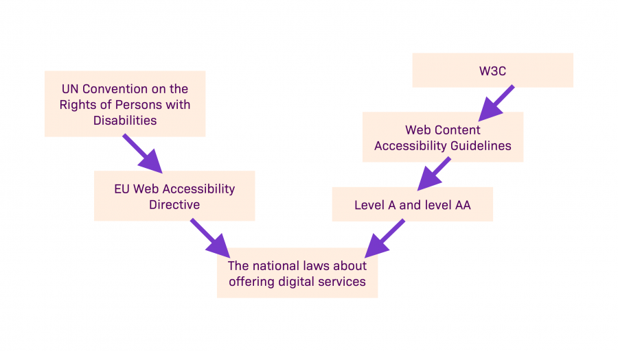
The national laws about offering digital services oblige public sector operators and some private sector organizations to comply with accessibility requirements. Different national laws inside the EU implement the European Union Accessibility Directive.
The directive and the individual laws are based on the United Nations Convention on the Rights of Persons with Disabilities (CRPD). Basically the laws obligate those concerned to comply with the WCAG level A and AA criteria. The organization behind the WCAG (Web Content Accessibility Guidelines) is W3C which maintains WWW recommendations.
The timeline obliges different organizations and types of content in different ways. Here you can access the EU directive on the accessibility of the websites and mobile applications of public sector bodies (timeline specified in Article 12).
Guideline jungle
Most of the national laws don't mention accessibility in newsletters. Does this mean that you have no obligation to make newsletters accessible? It does sound a bit odd when even social media is covered by some of the national laws.
The Web Accessibility Directive does not concern email communications but if the newsletter is also published on the organization's website, it is covered by the law and should be accessible. In most cases, a newsletter directs the reader to additional information. And that is why all the information in it should be somehow available on the website – especially for those public sector bodies that the Web Accessibility Directive obliges.
Therefore, a newsletter should not contain any essential information that is not available on the website. (The same goes for social media.)
There is a vast number of applications designed to read emails and they handle the mail they receive in varied ways. This is most likely one of the reasons why email communication has been officially left out from the Web Accessibility Directive. It is simply too hard to make sure that an email opens correctly in both ancient Outlook and, let's say, a new smart refrigerator. With websites, this is easier because different browsers work more coherently.
Why should your newsletter be accessible?
In this, like in everything related to accessibility, the national laws about digital services and WCAG are just the starting point and the work to be done with accessibility doesn't end where the laws don't bind anymore. Accessibility is about fairness – a necessity for some and beneficial to all.
What should you take into consideration?
The user groups that need accessibility are plentiful and the needs also alter between situations inside these groups. These challenges should be taken into consideration when designing a newsletter:
- different stages of visual impairment
- different stages of hearing impairment
- physical and motor disabilities such as cerebral palsy, muscle weakness, tremor or paralysis
- mental disabilities
- reading and learning difficulties
- concentration difficulties
- mental health problems
- memory impairment
- other cognitive problems
- poor command of the language used in the newsletter
- unfamiliarity in using digital services
- temporary challenges, such as noisy surroundings, bright sunlight, stress or a hand in a cast
On top of catering to these mentioned target groups, accessibility also serves the sender of the newsletter. The readership is simply larger when the newsletter is as accessible as possible. In addition, the outward impression remains consistent and of high quality when your newsletter's design and user experience are at the same level as your website's.
How to make your newsletter as accessible as possible?
Newsletters are usually built on a table format structure due to the functionalities of email clients. This in itself is a big challenge for reading machines. Most reading machines read everything from a table, also all the useless parts from the listener's point of view. They can be marked in the code as content that can be passed by the reading machine but then also links stop working.
The newsletter table structures in Liana®Cloud Email Marketing solution have been built to support the use of reading machines as well as possible. Keeping reading machines in mind, the newsletters sent with Liana's tools are always also sent in "plain text" format.
Tips on newsletter design and implementation
1. Logical order and header hierarchy
- The order of the content in the code is sensible and corresponds with the visual order.
- The order is rational in every size.
- Header hierarchy has been used consistently.
All this makes it that much easier to skip and skim the content for all users but is especially crucial for those with memory impairment or who operate through a keyboard interface.
2. Text alternatives for images (i.e. “alt tags”)
- Images that are essential for the content should have text alternatives.
- If an image is on the page purely as decoration, reading machines should be notified so they can skip these images.
- Including text as part of an image should always be avoided.
It is easy to add text alternatives in the Liana®Cloud Email Marketing user interface.
3. Good contrast and use of colors
- The contrast between background and text needs to be sufficient.
- The contrast between background and buttons needs to be sufficient.
- The use of colors doesn't inflict excessive sensory load by being too glaring.
- For example, links should be separated from other text in some additional way than just color, such as underlining. Other information should also not be communicated with just color.
The previous pointers help when one's vision is impaired or when content is being viewed in bright sunlight. Reducing the sensory load makes the content accessible for those with sensory defensiveness.
There are many ways for checking proper contrasts. For instance, you can try this tool by Utah State University.
4. Descriptive texts of links and buttons
- Every link in an email takes the reader "out". Due to this, it is even more important than on a website that an explanation is provided for what happens by clicking.
- Tell the reader what happens by clicking and what is the link's function.
“Read more” and “Seize the opportunity” are too vague to be texts in links or buttons. The button is not the right place for mystique or advertising. “See the courses for this spring” tells the reader much more.
5. Email subject line that is descriptive of the content
- Using reading machines takes up a lot of time and effort. Keeping that in mind, the subject line should represent the content of the newsletter so well that the reader can decide based on that whether they want to open the newsletter or not.
6. Plain text version
- Make sure that the newsletter is also being sent as a plain text version.
- When making a test delivery, always check the plain text version too so that you can be sure the content is being delivered as it should.
7. Consistent color scheme and structure
- The order in the newsletter is consistent throughout. For example, a headline is followed by an image and then the body of text.
- The same colors are being used to indicate the same actions or content.
Sometimes the things that are established practices on websites, might be forgotten when newsletters are in question. Very rarely you see different colored buttons on websites but in newsletters they come by here and there.
8. Structure works with different scaling
- The newsletter structure is correct in order to be scaled to different sizes in a controlled manner.
9. Text is easy to read and clear
- Text alignment on the left is the most readable option.
- Line spacing is big enough. The size depends on the amount of content and the font being used.
- Clear font. No study has fully demonstrated the superior readability of serif or sans-serif fonts and the issue is complex. Stick to simple and commonly supported fonts.
- The font is big enough. This depends on multiple factors so it is impossible to give a definitive number.
- Use plain language. Avoid language that is too abstract and using metaphors.

Not exactly a walk in the park but we'll survive! If accessibility makes you ponder, please don't hesitate to contact us. We'll give a helping hand in making your website and newsletter accessible.
Read more about website accessibility on our blog:


Comment
Comments
No comments